Final waitlist high fidelity mockup
Entrata provides property management software, which includes software for managing waitlists. Before starting this internship, I was not aware that waitlists were a thing. For my project, Entrata wanted to improve the waitlist software that they already had.
I will show you the final product before I go into detail of the process I went through to create it.
Introduction
I had the great opportunity to participate in a three-week UX internship at Entrata in the Silicon Slopes of Utah. Every day was planned out, which enabled me to know the pace I was expected to keep and act accordingly.
The Team
Entrata has three UX design teams and I was assigned to work on Jeff Nicholson’s team of two. It was he and Sean Peterson that I worked with.
Jeff is the team lead and has many responsibilities. While I was there, I relied mainly on Sean for guidance and direction. These guys were awesome and were open to all the questions and ideas I threw at them.
The Briefing
The team met briefly with the product manager over waitlists. I was told that Entrata already had a design for them, but it needed to be improved. The target audience for the design was conventional, multi-family housing. The team and product manager wanted me to keep the same audience as the focus of my research.
The Research
I was not shown the existing waitlist design. Jeff and Sean wanted me to create my own from my research.
The research I conducted mainly came from the internet. I found a lot of information about subsidized and military housing, but I couldn’t find any for conventional housing.
Challenging the Assumptions
With a lack of information from the internet, I decided to visit and call a few local apartment complexes. Of the seven conventional housing complexes contacted, only two ever had waitlists. These waitlists were something that were only used on rare occasion and there were fewer than ten names on each list.
I found this information to be interesting, so I decided to search further in more populated areas, such as New York City and Los Angeles. Unfortunately time would not permit me to delve into these places. However, I was able to contact one apartment complex in New York. They offered both conventional and 20% affordable housing. Only the affordable housing had a waitlist.
Conclusion
Even though the primary goal was to design for conventional housing, there were not enough data to support designing for this particular audience. The data showed that the focus of the design needed to be on subsidized and military housing.
The Design Process
Sean and I got together to map out my research. It was clear that each type of waitlist (Military, HUD and other affordable) would need its own set of information required to be displayed to management. We chose to focus on HUD (US Dept. of Housing and Urban Development) info requirements, because those are the most well-defined of all housing types.
The Time-Limit
Due to the limited time I had for this project, I was not able to design for each and every scenario, so my design had to be adaptable to every type of waitlist.
The Sketching
Sean and I liked the idea of a split screen , with list items on the left and a detailed view on the right.
After some iteration, we felt we had a good starting point to move on to pen and paper.
Once the design was better defined, I moved on to Balsamiq to introduce scale and detail.
I was hesitant at first to use Balsamiq, because I felt that Sketch was easier to use in duplicating and adjusting artboards. However, I found that Balsamiq was easier in some ways, because there is already of library of common web shapes. Another big advantage I saw for using Balsamiq was that it still has the hand-drawn look, making it easier for others to understand that the design is still in the beginning stages.
The Pattern Library
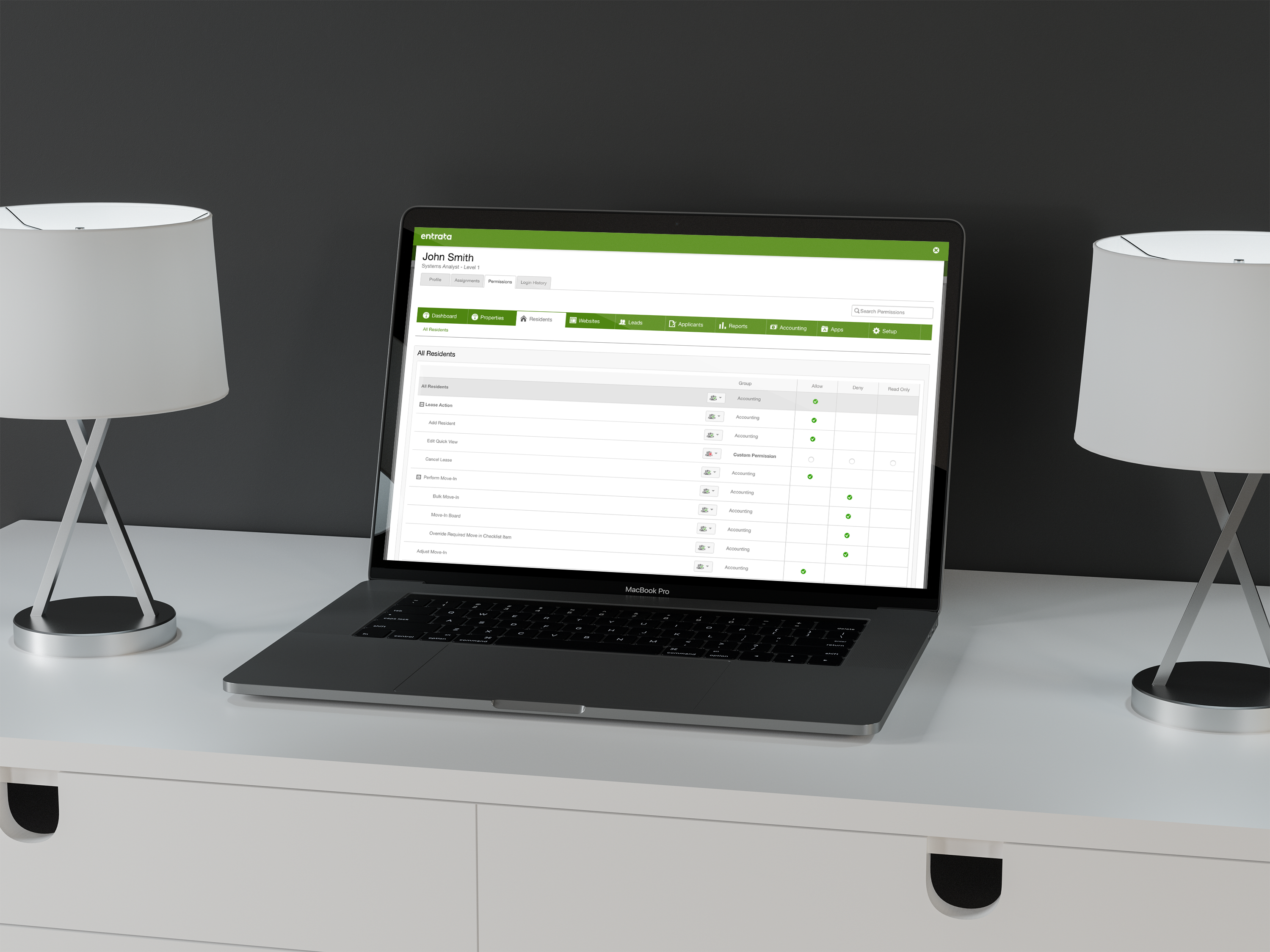
Entrata has an existing pattern library that I had to use to ensure congruity with the existing software design. It was difficult at first, because it felt so constricting. Once I got used to it, the design turned out to be a good design fit.
Creating Flow and Asking Questions
As I was building the high fidelity wireframes, I needed to know how many to build. I also needed a way to document questions or ideas I had for each page. I found cardboardit.com and decided to give it a try.
I found this site to be very useful. I created a user map with green and blue to help me flush out the needed clickables and pages for the pending prototype. I also used red and orange to define pages and list questions and ideas to pitch to the other teams, the UX director and the product manager.
The Pitch…
There were times scheduled for me to pitch my solutions to different people within Entrata. These pitches were very helpful in finding the best design for my solution.
…to the Teams
My first pitch was to the other UX teams, specifically the interns. I explained my research and solution to them and showed them my designs. They thought it was good overall, but pointed out some things that were confusing, such as adding an apartment to offer onto the applicants profile card. They suggested to have a button with words instead of a simple plus sign.
…to the UX Director
After taking their feedback and working further into the design process, I was able to pitch my solution to Les Eldridge, the UX director of Entrata. The purpose of this pitch was for him to make sure that I was keeping up with the timeline he set. It was also another chance for me to practice pitching my solution. He said I was doing well and told me to keep up the good work.
…to the Product Manager
The next day, my team and I met with the Product Manager and I gave my spiel for the third time, with more finished wireframes. He loved the way it was set up. The biggest issues that were addressed were showing flow in the status updates in offering apartments to applicants and displaying the best apartment match for the applicant.
The fixes for these problems are shown above. I added a flow chart to the applicant card and highlighted the best-matched unit in green with a darker green “best match” in the corner.
The Prototype
I used the Craft plugin in Sketch to link all of my artboards together, then exported them to InVision. This was a fantastic tool that let me see all of the connections in a map, instead of listed, like InVision usually does.
After I made sure everything was linked properly, I was ready to start user testing.
User Testing
Entrata has a fantastic, high tech user testing lab. Unfortunately, they were doing their yearly summit and some of the tech (such as the eye-tracking device) was taken out of the room to use on location. We had to improvise with what we had.
We were able to use Entrata’s camera’s to record both me and the participant. In order to record the screen, clicks and the participant, I conducted the user tests in the user testing room from my computer using Silverback. Other team members sat in the observation room to record on their side and take notes.
The ideal people to test would be actual property managers. Unfortunately, the circumstances would not allow that. We asked some employees to participate, who work directly with Entrata’s clients and are familiar with their preferences.
The Script
I typed up the script to be read from my phone as the participants navigated the prototype on my laptop.
The script included a welcome and making sure the participants were comfortable. They were there to test the design and if they were to have trouble with navigation, it would not be their fault - it would be the fault of the design.
The First Round
Two people were interviewed in the first round of testing. I had them first view the available apartments, then view a certain applicant on the waiting list. They were to add the first two matched apartments to the applicant’s profile card and issue the offer of these apartments to the applicant. Then we had them follow up with the applicant, then generate a contract or archive the applicant.
The Feedback
The participants liked the design and it’s functionality. There was some confusion about the progress bar. They did not realize that it was showing the steps of issuing the offer and generating the contract.
One of the participants would like to have had the ability to filter the display to show participants at different statuses (such as archived applicants).
The last issue pointed out was that the design lacked the ability to manually retract an offer. With all these ideas in mind, I set to work to build on these ideas.
Script Feedback
It was great having others in the observation room, because they were able to tell me what to improve on for future tests.
The Improvements
I first set out to ideate different versions of the progress bar. I would generate a set, show it to a few people on the team and then go back and generate another. Below is the ideation for the progress bar on the applicant’s profile card.
I did not have enough time to add filters according to the one suggestion, but I was able to generate a few ideas that the team could use once I finished with the internship.
Adding a way to manually retract the offer was the simplest fix. I added “Retract Offer” in blue (to show clickability) next to the “follow up” button, as seen below.
The Final Round
The last interview was conducted on the last day of my internship. It was difficult finding people for user testing, since so many were gone to Summit. Eventually we found one who was available. It was great because she works a lot with people who use the waitlists.
I ran this participant through the same script with the new improvements and it turned out great! I have attached the video of the user test for you to view.
The Final Design
The Final Conclusion
I feel that the design I created was a great improvement upon Entrata’s existing waitlist design. I believe that I accomplished my goal in creating a versatile format that can be applied to subsidized, military and conventional housing. I know that what I designed will be useful for Entrata’s future.
The Handoff
After the final interview, my time at Entrata was at its end. I gathered all my research, notes and designs and handed them over to Sean and Jeff. It kind of felt like handing an 3rd grade drawing to my parents to be hung on the fridge.
The Debriefing
When all was said and done with the team, I met with Les (the UX director) and we talked about my experience and how I felt about it. He also gave me time to ask questions about the field of UX, his interviewing process and the future of design. It was a great way to end a great internship.
The End
This internship has been by far my favorite experience with UX design. It has shown me that I am capable of doing more than I realized. It gave me a sense of accomplishment and that I have so much that I can contribute to the world of user experience.


