Quick Overview
My Role: UX Designer (Co-led with 1 design partner & 1 UX researcher)
Timeline: 1 year (12 four-week sprints)
Deliverables: ~200 user-tested screens & hand-offs
Target Audience: United Airlines Cargo Contact Center Agents (Power Users)
Tools & Strategies: Figma, FigJam, User Research, Journey Mapping, Card Sorting, Wireframing, Prototyping, User Testing
1. The Real Problem & Strategic Pivot
The Original Business Plan
The business originally wanted to mirror the new customer-facing booking wizard over to our internal contact center tool to save dev time. They also wanted us to add the ability to generate and send quotes. At the time, agents didn't have a way to track quotes in the system, so they were giving quotes guerrilla-style with no paper trail.
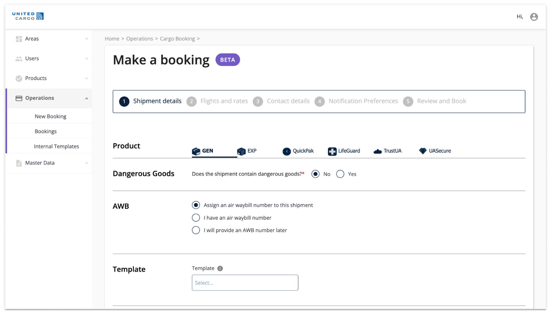
Proposed cargo agent portal mirroring customer-facing booking wizard
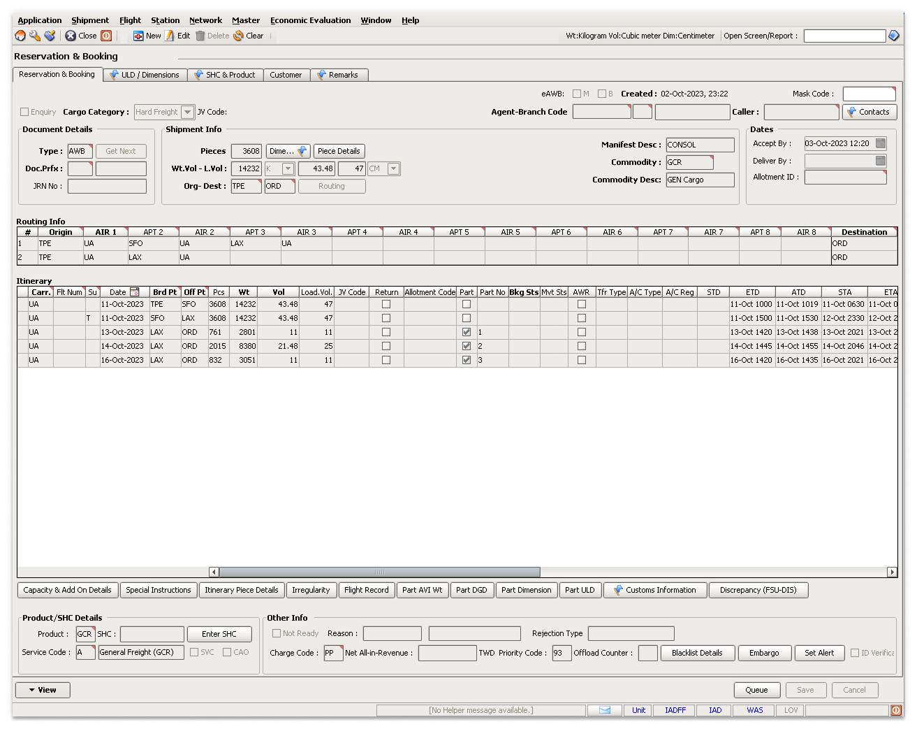
Existing United Cargo agent booking app
The Turning Point
We took a 2-day trip to the Houston contact center to shadow 4 agents. Seeing them resort to printed cheat sheets, complex Excel workarounds, and even legacy DOS terminals to get through calls quickly proved they didn't need a slow, step-by-step wizard.
Using our Houston research and pointing to a previous passenger-tool redesign that failed because it tried to mirror the customer side, my team convinced the Project Owner to let us scrap the wizard idea and build a dedicated agent portal from scratch.
2. Applied UX Strategy
Contextual Inquiry: Shadowed 4 agents in Houston to map real-world workarounds and legacy DOS terminal reliance.
Competitive Benchmarking: Analyzed complex enterprise tools (ServiceNow, Salesforce, EMR software) to evaluate dense UI layout patterns and single-page navigation models.
IA & Card Sorting: Ran card sorting and journey mapping with 8 SMEs to determine field priorities and group critical data.
Risk Mitigation Strategy: Leveraged past project failure data to persuade stakeholders to pivot away from consumer wizards.
Cross-System Mapping: Mapped integration touchpoints with Salesforce and backend rate engines to keep workflows seamless.
3. Key UX Improvements in Aeris
Unified over Sequential: Aeris uses a single "Bird’s-Eye View" with collapsible accordions rather than the old wizard's 4 sequential pages that hid context.
Flexible over Linear: Background field validation offers non-linear flexibility compared to the old wizard's locked linear flow.
Power User over Consumer: A persistent side summary provides instant reference for agents, replacing the high whitespace layout designed for casual consumers.
Fixed Grid over Scrolling: A fixed-width grid optimized for dual widescreen monitors eliminates the excessive scrolling required by the old proposed wizard.
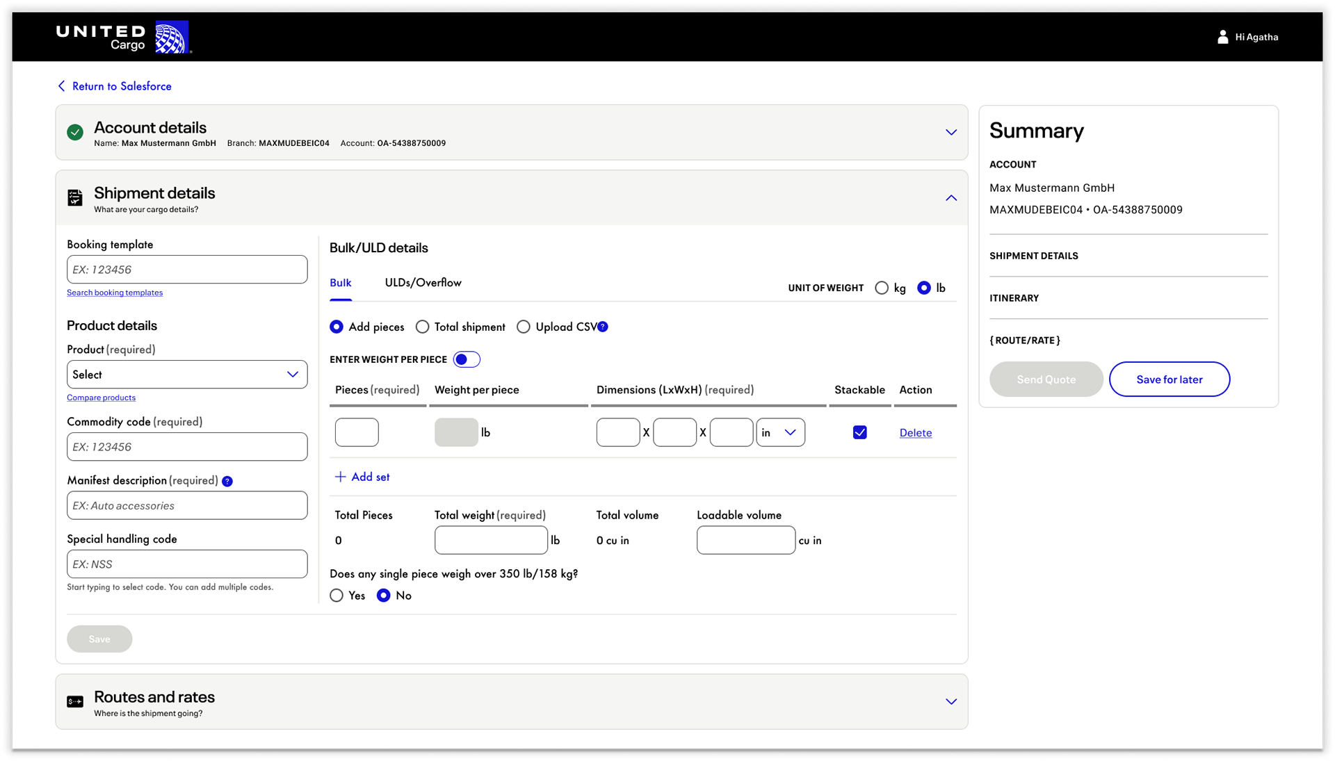
Redesigned agent booking workspace - Aeris
4. Real-World Trade-Offs & Handling Dev Constraints
Adapting Customer Components
United has two design systems: Orion (internal) and Atmos (customer-facing). We chose to use Atmos to make implementation easier for our offshore dev team, but we deliberately broke and condensed several components so agents could get the high information density they needed.
Managing Off-Sync Sprints
The offshore developers focused on the customer side first, meaning we were 90% done with our designs before they began reviewing them in depth.
5. Takeaways
Validated Agent Excitement
Testing across our 12 sprints showed that agents were super excited for the new layout compared to the existing setup.
Early Alignment is Everything
Getting business stakeholders on your side early using real qualitative field data and risk history makes the entire design process so much smoother.